
Solburst Score: OCHO Candy
When I started learning more about food and what I was putting in my body, making dietary changes was difficult at first. As a law student on a budget, my go-to comfort foods were Frosted Flakes and Cinnamon Toast Crunch (because they were DELICIOUS). Plus, I was deprived of all sugary cereals when I was a kid so I was determined to make up for lost time. Grabbing a quick bag of chips or a candy bar between classes was so easy, and honestly the only choices available in the law school vending machine. Oh, and they were also cheap.
Nevertheless, it didn’t take long for me to learn that these cheap and easy foods were killing me. But after years of not thinking much about food, it took time to figure out what food habits would replace my old ones. Once I learned more about my alternatives and experienced how they made me feel, it was hard to believe I’d ever lived any other way. Although the branding is tempting, I haven’t had cereal in 3 years, I can count on one hand how many times I’ve eaten potato chips, and you’d have to pay me big money to eat a drug store candy bar. To be honest, the products I once found delicious are gross to me now.
That being said, we all get cravings. Sometimes those cravings are for something healthy, and every once in a while we get a craving for something more indulgent. A year and a half ago, I had an odd craving for a candy bar. I say “odd” because I don’t have a sweet tooth and I’m not a chocoholic. But I wanted a candy bar REALLY BAD--one with chocolate and caramel and nuts and nougat--and my obsession was so strange that I feared for my future self if it ever got pregnant.
My husband offered to go to the corner store and grab me a Snickers, but I knew that wouldn’t do. Snickers didn’t taste the way it once did to me so I knew I would take one bite and throw it away. And I was a total mess about it. HOW WERE THERE NO ORGANIC CANDY BARS?! The short of it is, it was a pathetically rough couple of days. My craving eventually went away and I survived (*insert eye roll*).
A few months passed and I ran into Whole Foods on a Saturday to grab a few snacks for the beach. My husband, unlike me, is a major chocoholic, so I sped through the candy aisle to get him a treat. That’s when it caught my eye, a row of party-colored boxes filled with chocolate bars I’d never seen before. The label read, “Organic” with the brand name “OCHO”, and my mestiza heart melted. Then I read on, ”milk chocolate filled with nougat, caramel, and peanuts”, and I think I let out an audible, “wooooow”. My prayers had been answered. I grabbed two candy bars, checked out, and got into the car dancing.


EMERGENCE
A. Contour (7/10)
Differentiation: How does the shape of the product compare to the competing shapes around it on a shelf?
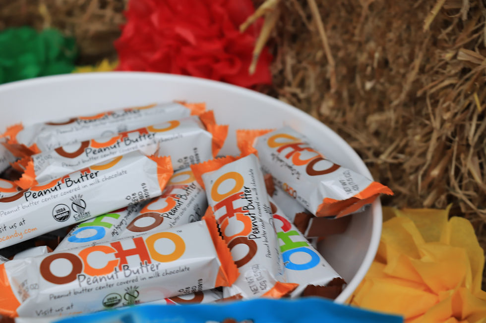
The shape of an OCHO bar does not differ in shape from the traditional candy bar we grew up loving. That being said, among a plethora of milk and dark fair-trade and organic chocolate bars, OCHO bars deliver a nostalgia that brings back familiar packaging of the past. The only difference might be the length of the bar, which in comparison to the Mars, Nestle, or Hershey candy bars of today, might seem small.
Thoughtfulness: Is the shape of the product designed for human use, or does it have any bearing on the health of the planet?
The shape of the OCHO candy bar is convenient (easy to throw in your pocket, pack in a small purse, or stash away in a small backpack pocket). No bearing on the health of the planet, but maybe to the health of humans, who are part of the planet, since the portion size is smaller than your average candy bar.
Organization: How does the organization of the icons or words on the product compare to others and orient our attention?
OCHO’s icon is its name. The name is large, bold, short, and center. The rest of the words are carefully distributed in a whimsical typeface that looks handwritten and does not compete with the OCHO logo. Overall, the organization of icons and words is more approachable than most other organic chocolate bars. OCHO design is simple, strong, and fun. Organic and fair-trade chocolate bar design tends to be serious, busy, and/or stale.
B. Color (8/10)
Context: How do the conditions affect the way we experience the chosen color(s)?
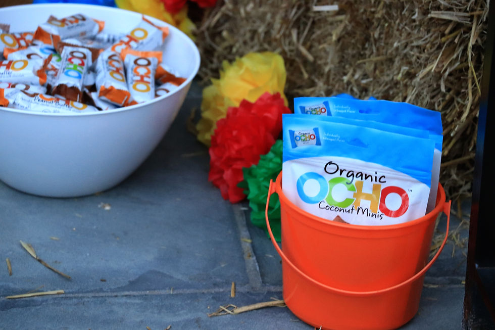
OCHO’s colors are probably its strongest design asset. Amongst the browns, blacks, and golds of other organic chocolate bars, OCHO’s bright colors are impossible to miss. OCHO’s candy bars are commonly shelved inside an OCHO box that corresponds to the candy stacked inside, which differs in color according to flavor.
Contrast: Does the design master the use of contrast through color?
OCHO executes contrast brilliantly. Each OCHO logo takes on different colors depending on the candy bar flavor, but each logo pops on a white shiny background
Meaning: Do we find the tonal value of the colors appropriate for the suggested product use? How do they make us feel?
Each OCHO bar is color-coded based on the bar’s flavor. The colors paired with the OCHO flavors are perfect! For example, the primary color for Caramel & Peanut is amber brown, the primary color for Coconut is island blue, and the primary color for Peppermint is candy cane red. Each color corresponds to the images that pop in our brain when we think of the flavor, making it easy to remember and keep an eye out for a particular color when you’re searching for a particular flavor. The nostalgia is real.
C. Content (7/10)
Clarity: Is the content easy to pronounce and does it quickly communicate a company’s vision?
The content on the OCHO candy bar is easy to pronounce. The phrase, “The Organic Candy Bar” sits on top of the logo, “OCHO”, with the flavor name at the bottom. While the name is fun to stay and visually steals the show, “The Organic Candy Bar” is definitely the most important piece of content on the packaging.
Cleverness: Is the content (name, slogan, etc.) creative and memorable?
The OCHO name is playful and easy to remember. My brain couldn’t help but pray that the founders were a Mexican family of 8, but sadly I was wrong. Even if the name is based on a shortened version of “organic chocolate”, I still get giddy that there is a fiesta-colored Spanish word on a candy bar at Whole Foods.
Compulsion: Does the content convey passion that compels us to buy?
The phrase, “The Organic Candy Bar” says it all. Anyone who has dedicated their life to making delicious organic chocolate candy bars has cojones and a serious passion for food. I’m grateful.
___
I dreamed that there would one day be an organic chocolate candy bar filled with caramel, peanuts, and nougat. As tough as I am on design, I didn’t even care what it looked like. Now my dream has come true, and the design is 100. It’s what’s inside that counts, but OCHO’s goodness is so good it shines through to the outside.

ENGAGEMENT
A. Utility (7/10)
Time: Does the company choose the right time and cadence to introduce another touchpoint?
Aside from the amazing experience of eating an OCHO bar, other touchpoints for OCHO include an occasional newsletter if you’re on the company’s email list, and a monthly subscription service, inspirational photos on Instagram, and an wonderful website complete with a store locator if you’re in need of an OCHO bar ASAP.
Place: Is the engagement shared through the appropriate channels?
Design engagement is minimal in comparison to other large brands. But OCHO is new and their current channels make sense. I’m excited to watch the company grow and expand offerings in most big box stores as well as have the opportunity to sponsor large community events.
Quality: Does the engagement meet or exceed the expectations set during the emergence experience?
I’ll be honest, lots of new brands have brilliantly designed products but terribly designed touchpoints. While websites are easier to make these days, there are surprisingly still a ton of bad ones. As someone who started a candy company two years ago, I can also appreciate how difficult it is to curate an aesthetic social media account with limited products, especially chocolates since they are less photogenic when compared to candy like gummies. From tearing open a wrapper, to following the company on digital platforms, the OCHO experience keeps getting better and better.
B. Understanding (8/10)
Intuition: Does the engagement uncover the deep subconscious values we are looking for in the market?
OCHO uncovers very conscious and subconscious values. People increasingly search for better versions of the food they grew up eating, avoiding unnecessary ingredients that make food unnatural or harmful. In addition, we are all looking for design experiences that transport us. Americans especially value nostalgia, the way things used to be when our lives were simpler and more carefree. That’s why OCHO succeeds. The company delivers a product we are looking for and a design experience that takes us back while simultaneously making us grateful for the present. Remember how excited you were to get a fun size Snickers or Twix? OCHO helps us relive those moments but with better design.
Empathy: Does the engagement embody the human challenges we face now, and those to come?
We finally have an organic candy bar (and it’s good!). It sounds like a first world problem but it’s really not. All the major candy bar brands have taken over every part of the world. OCHO and companies like it are long overdue. How long will it be till they eclipse the brands of yesteryear? Probably too long, but it’s worth trying.
Solution: Does the engagement make the brand a go-to solution for a problem?
Absolutely! When I want a candy bar, OCHO is the solution. When I need to buy chocolate candy (holidays, parties, etc.), I always buy OCHO. It’s more expensive, but again, our bodies deserve better. You get what you pay for.
C. Unity (7/10)
Diversity: Does the engagement build a tribe of diverse people based on shared values or passions?
This question is hard to answer for OCHO. The company is new and the product caters to the health-conscious person, particularly those that have to be or can afford to be health-conscious. For example, OCHO bars are gluten-free, which is FANTASTIC given the rising number of people who are diagnosed with celiac and other autoimmune diseases (like yours truly!). And yes, the bars are expensive compared to the alternatives, but it is a treat and should be treated like one. We shouldn’t be crushing bags of chocolate bars on the reg. So while other healthier, more expensive versions of staple food may be harder to justify to those that don’t have as much money, splurging on OCHO every once in a while is doable.
Sentience: Does the engagement prove that the brand is aware and responsive to trending or troubling issues?
Yes, it is very difficult to find organic candy. Candy is not the food group we want to incorporate in our diet frequently, but it’s okay to enjoy it in moderation! No one needs to feel like they can never enjoy a piece of candy. That sounds just as unhealthy as eating it all the time. We need to have organic options for everything, even candy bars!
Simplicity: Does the engagement provide natural and simple ways for us to connect with one another?
Treats are for sharing. Organic treats are more fun to share. Buying OCHO candy for holidays and events has been a great way to connect with others. It’s easy and it’s delicious!
___
After a product first emerges, following through on expectations is everything. For OCHO especially, making a first great impression is imperative because we don’t buy candy as often as we buy other everyday foods. OCHO does a wonderful job with their design experience from end to end. The wrapper makes us smile and intrigued, the product is designed well and tastes delicious, their digital touchpoints are solid. For a new candy company OCHO has done a wonderful job at covering most of the design bases necessary for a stellar brand. They don’t have lots of competition right now, but even if they did, I think they’d still be a standout!
Visit the company website to start your experience and order OCHO products online : www.ochocandy.com

EMOTION
A. Rousing (7/10)
Psychology: Does the experience design correspond to our emotions and capabilities?
Seeing OCHO for the first time precipitates visions we don’t experience often in our adult lives: a new box of crayons (Crayola of course), Legos, Play-Doh, Mr. Sketch scented markers, and pencil grips...basically all the best things from childhood. Imagine combining the joy of Halloween and Valentine’s Day from our youth and the euphoria of a farm-to-table meal and 9PM bedtime in our adulthood and BAM! that’s the OCHO candy bar.
Authenticity: Does the experience design appeal to emotion through genuine and consistent interest?
YES. OCHO doesn’t push their product in unhealthy or sketchy ways. There are lots of products out there that should be used in moderation, but are advertised otherwise. OCHO doesn’t participate in that behavior and they are better off for it. It makes the brand more compelling..
Magic: Is the design experience more attractive than the product/service offered?
I think this is the first time I have trouble answering this question for a design experience I reviewed on the site. I think OCHO’s experience and product offering are even. The experience is great, but so is the product. This isn’t bad, and there are obvious limitations to what you could do with a candy bar, but there is room for improvement in terms of how to engage with people when they pick up an OCHO bar or are enjoying one.
B. Reliable (8/10)
Transparency: Is the experience design vulnerable and open about company practices and culture?
There’s only so much you can do on a small candy bar wrapper, so no, there isn’t a ton of information about company practices or culture on the OCHO wrapper. That being said, as I’ve mentioned for other products, the design is a huge clue about what type of company is behind the product. OCHO’s website has an excellent ‘ABOUT’ section on their website complete with a really thorough FAQ section. As someone who cares about ingredients and sourcing, OCHO is a dream and the company is still working on ways to improve and expand their selection. The vulnerability they share on their site is really refreshing and rare.
Action: Does the experience design communicate values and prove that the company keeps promises?
OCHO’s experience design speaks volumes about the company without saying much. The company’s vulnerability on their site and social media accounts also build trust and excitement. For example, OCHO’s peppermint minis used to be dairy free. They’ve since had to re-organize production processes and the peppermint mini’s are now made with butter. OCHO is direct and transparent about their processes, company changes, and they are committed to working on a vegan-friendly version of the candy.
Commitment: Is the experience design representative of the company’s dedication to customer service?
The company’s FAQs demonstrate concern for customer service and questions on social media accounts are answers quickly and warmly. I’ve been really impressed with OCHO’s fan engagement given how small and new the company is.
C. Resonant (7/10)
Archetype: Has the experience design aligned itself with a particular theme to appeal to our ego, emotional state, need, or aspiration?
Like other colorful and playful products I enjoy, OCHO’s style is reinvigorating. OCHO design is bold, bright, and amusing. It delivers a product we’ve all wanted for so long and a cheery disposition that reminds us to celebrate the small things in life..
Optimism: Does the experience design acknowledge and respect human struggles, and inspire hope?
Yes! All OCHO bars are organic, most of them are gluten free for those with celiac disease, a few are dairy free for those lactose intolerant or allergic to dairy, and the company continues to experiment and work on mabking versions of equally delicious candy bars for people with food restrictions. There are no shortcuts here. The company takes its time and is committed to producing only great-tasting bars that fit people’s diets.
Courage: Does the experience design focus on the big picture and push boundaries?
OCHO has done a great job at balancing all the many types of design that make up experience. The company is pushing boundaries by producing OCHO bars and redefining how a candy bar should be produced, what it should look like, and how it should taste. I love that the company set up shop in West Oakland, a growing a underrated part of the San-Francisco-and-Mountain-View-obsessed Bay Area. I think courageous companies like OCHO that put down roots in forgotten areas with the intent to revive the area and use neglected resources and slack space will end up on top. And I’m excited.
___
OCHO's design experience is solid. It stands out, it maintains a level of clean, trustworthy, and delicious interaction, and it conjures up all the feelings we want to have when we're on the hunt for a candy bar. Also, have I mentioned OCHO bars are organic. Yeah, I know I have. I'm not over it yet.
En Español: (disponible muy pronto)
EMERGER
A. Contorno (/10)
Diferenciación: ¿Cómo se compara la forma del producto con la forma de los productos de la competencia en el estante?
Consideración: ¿La forma del producto está diseñada para uso humano o fue diseñada para mejorar las condiciones ambientales?
Organización: ¿Cómo se compara la organización de los iconos o palabras en el producto con otros y orienta nuestra atención?
B. Color (/10)
Contexto: ¿Cómo afectan las condiciones a la forma en que experimentamos los colores elegidos?
Contraste: ¿El diseño usa contraste a través del color?
Significado: ¿Es el valor tonal de los colores apropiado para el producto? ¿Cómo nos hacen sentir estos colores?
C. Contenido (/10)
Claridad: ¿El contenido es fácil de pronunciar? ¿Se comunica rápidamente la visión de la empresa?
Inteligencia: ¿Es el contenido (nombre, eslogan, etc.) creativo y memorable?
Compulsión: ¿El contenido transmite pasión que nos obliga a comprar?
___
REUNIR
A. Utilidad (/10)
Tiempo: ¿La empresa elige el momento y el ritmo adecuados para introducir otro punto de contacto?
Ubicación: ¿Se comparte la interacción de diseño a través de los canales apropiados?
Calidad: ¿El compromiso cumple o supera las expectativas establecidas durante la primera experiencia de diseño?
B. Comprensión (/10)
Intuición: ¿La experiencia de diseño revela los profundos valores subconscientes que estamos buscando en el mercado?
Empatía: ¿La experiencia de diseño encarna los desafíos humanos que enfrentamos ahora y los que vendrán?
Solución: ¿La interacción de diseño hace que la marca sea una solución para un problema?
C. Unidad (/10)
Diversidad: ¿La interacción de diseño construye una tribu de personas diversas basadas en valores o pasiones compartidas?
Responsivo: ¿La interacción de diseño muestra que la marca es consciente y responde a problemas populares?
Sencillez: ¿La interacción de diseño proporciona formas naturales y sencillas para que nos conectemos unos con otros?
___
EMOCIÓN
A. Conmovedor (/10)
Psicología: ¿El diseño de la experiencia corresponde a nuestras emociones y habilidades?
Autenticidad: ¿La experiencia del diseño apela a la emoción a través de un interés genuino y constante?
Magia: ¿Es la experiencia de diseño más atractiva que el producto / servicio ofrecido?
B. Fehaciente (/10)
Transparencia: ¿Es la experiencia de diseño vulnerable y abierta sobre las prácticas y la cultura de la empresa?
Acción: ¿La experiencia de diseño comunica valores y demuestra que la empresa cumple sus promesas?
Compromiso: ¿Es la experiencia de diseño representativa de la dedicación de la compañía al servicio al cliente?
C. Resonante (/10)
Arquetipo: ¿Se ha alineado la experiencia de diseño con un tema en particular para atraer a nuestro ego, estado emocional, necesidad o aspiración?
Optimismo: ¿La experiencia de diseño reconoce y respeta las luchas humanas e inspira esperanza?
Valor: ¿La experiencia de diseño se centra en el panorama general y empuje los limites?
___